ShopDreamUp AI ArtDreamUp
Deviation Actions


Suggested Deviants


Suggested Collections
![[Magi OC] Asuna](https://images-wixmp-ed30a86b8c4ca887773594c2.wixmp.com/f/939a02c1-ac9b-4432-9987-277bc3507356/d9vf4vy-3a4ad669-c3dd-4eed-a71f-4ba139b50f50.png/v1/crop/w_184,h_184,x_0,y_21,scl_0.0736/_magi_oc__asuna_by_asucchi_d9vf4vy-92s-2x.png?token=eyJ0eXAiOiJKV1QiLCJhbGciOiJIUzI1NiJ9.eyJzdWIiOiJ1cm46YXBwOjdlMGQxODg5ODIyNjQzNzNhNWYwZDQxNWVhMGQyNmUwIiwiaXNzIjoidXJuOmFwcDo3ZTBkMTg4OTgyMjY0MzczYTVmMGQ0MTVlYTBkMjZlMCIsIm9iaiI6W1t7ImhlaWdodCI6Ijw9MzYxNiIsInBhdGgiOiJcL2ZcLzkzOWEwMmMxLWFjOWItNDQzMi05OTg3LTI3N2JjMzUwNzM1NlwvZDl2ZjR2eS0zYTRhZDY2OS1jM2RkLTRlZWQtYTcxZi00YmExMzliNTBmNTAucG5nIiwid2lkdGgiOiI8PTI1MDAifV1dLCJhdWQiOlsidXJuOnNlcnZpY2U6aW1hZ2Uub3BlcmF0aW9ucyJdfQ.5p7P5gIDDQo1kjAf9gcZ0LsaDS4U_zUZgnG43w3o15g)
![[Magi OC] Asuna](https://images-wixmp-ed30a86b8c4ca887773594c2.wixmp.com/f/939a02c1-ac9b-4432-9987-277bc3507356/d9vf4vy-3a4ad669-c3dd-4eed-a71f-4ba139b50f50.png/v1/crop/w_92,h_92,x_0,y_10,scl_0.0368/_magi_oc__asuna_by_asucchi_d9vf4vy-92s.png?token=eyJ0eXAiOiJKV1QiLCJhbGciOiJIUzI1NiJ9.eyJzdWIiOiJ1cm46YXBwOjdlMGQxODg5ODIyNjQzNzNhNWYwZDQxNWVhMGQyNmUwIiwiaXNzIjoidXJuOmFwcDo3ZTBkMTg4OTgyMjY0MzczYTVmMGQ0MTVlYTBkMjZlMCIsIm9iaiI6W1t7ImhlaWdodCI6Ijw9MzYxNiIsInBhdGgiOiJcL2ZcLzkzOWEwMmMxLWFjOWItNDQzMi05OTg3LTI3N2JjMzUwNzM1NlwvZDl2ZjR2eS0zYTRhZDY2OS1jM2RkLTRlZWQtYTcxZi00YmExMzliNTBmNTAucG5nIiwid2lkdGgiOiI8PTI1MDAifV1dLCJhdWQiOlsidXJuOnNlcnZpY2U6aW1hZ2Uub3BlcmF0aW9ucyJdfQ.5p7P5gIDDQo1kjAf9gcZ0LsaDS4U_zUZgnG43w3o15g)
![Sola Reference Sheet [Magi OC]](https://images-wixmp-ed30a86b8c4ca887773594c2.wixmp.com/f/4f03a800-6849-4dec-b6b9-adb99ec92b3c/d8wfnhu-0a10d049-49cf-4672-a92d-606c2b767530.png/v1/crop/w_184,h_184,x_9,y_0,scl_0.21028571428571,q_70,strp/sola_reference_sheet__magi_oc__by_kurokuni_d8wfnhu-92s-2x.jpg?token=eyJ0eXAiOiJKV1QiLCJhbGciOiJIUzI1NiJ9.eyJzdWIiOiJ1cm46YXBwOjdlMGQxODg5ODIyNjQzNzNhNWYwZDQxNWVhMGQyNmUwIiwiaXNzIjoidXJuOmFwcDo3ZTBkMTg4OTgyMjY0MzczYTVmMGQ0MTVlYTBkMjZlMCIsIm9iaiI6W1t7ImhlaWdodCI6Ijw9ODU0IiwicGF0aCI6IlwvZlwvNGYwM2E4MDAtNjg0OS00ZGVjLWI2YjktYWRiOTllYzkyYjNjXC9kOHdmbmh1LTBhMTBkMDQ5LTQ5Y2YtNDY3Mi1hOTJkLTYwNmMyYjc2NzUzMC5wbmciLCJ3aWR0aCI6Ijw9MTAyNCJ9XV0sImF1ZCI6WyJ1cm46c2VydmljZTppbWFnZS5vcGVyYXRpb25zIl19.GIZEfxaUlXaCsS0HVfUhO1bkoGlnyDoKCCu8fJRQ32s)
![Sola Reference Sheet [Magi OC]](https://images-wixmp-ed30a86b8c4ca887773594c2.wixmp.com/f/4f03a800-6849-4dec-b6b9-adb99ec92b3c/d8wfnhu-0a10d049-49cf-4672-a92d-606c2b767530.png/v1/crop/w_92,h_92,x_5,y_0,scl_0.10514285714286,q_70,strp/sola_reference_sheet__magi_oc__by_kurokuni_d8wfnhu-92s.jpg?token=eyJ0eXAiOiJKV1QiLCJhbGciOiJIUzI1NiJ9.eyJzdWIiOiJ1cm46YXBwOjdlMGQxODg5ODIyNjQzNzNhNWYwZDQxNWVhMGQyNmUwIiwiaXNzIjoidXJuOmFwcDo3ZTBkMTg4OTgyMjY0MzczYTVmMGQ0MTVlYTBkMjZlMCIsIm9iaiI6W1t7ImhlaWdodCI6Ijw9ODU0IiwicGF0aCI6IlwvZlwvNGYwM2E4MDAtNjg0OS00ZGVjLWI2YjktYWRiOTllYzkyYjNjXC9kOHdmbmh1LTBhMTBkMDQ5LTQ5Y2YtNDY3Mi1hOTJkLTYwNmMyYjc2NzUzMC5wbmciLCJ3aWR0aCI6Ijw9MTAyNCJ9XV0sImF1ZCI6WyJ1cm46c2VydmljZTppbWFnZS5vcGVyYXRpb25zIl19.GIZEfxaUlXaCsS0HVfUhO1bkoGlnyDoKCCu8fJRQ32s)


![[LR] Rosalie Turn Casual 1/2](https://images-wixmp-ed30a86b8c4ca887773594c2.wixmp.com/f/ed93bac3-d37a-4f83-85b5-275be8deb869/db3wl2v-dbce3a44-a8af-409d-93df-b316228e79ed.jpg/v1/crop/w_184,h_184,x_25,y_0,scl_0.22115384615385,q_70,strp/_lr__rosalie_turn_casual_1_2_by_annerpc_db3wl2v-92s-2x.jpg?token=eyJ0eXAiOiJKV1QiLCJhbGciOiJIUzI1NiJ9.eyJzdWIiOiJ1cm46YXBwOjdlMGQxODg5ODIyNjQzNzNhNWYwZDQxNWVhMGQyNmUwIiwiaXNzIjoidXJuOmFwcDo3ZTBkMTg4OTgyMjY0MzczYTVmMGQ0MTVlYTBkMjZlMCIsIm9iaiI6W1t7InBhdGgiOiJcL2ZcL2VkOTNiYWMzLWQzN2EtNGY4My04NWI1LTI3NWJlOGRlYjg2OVwvZGIzd2wydi1kYmNlM2E0NC1hOGFmLTQwOWQtOTNkZi1iMzE2MjI4ZTc5ZWQuanBnIiwiaGVpZ2h0IjoiPD02NjYiLCJ3aWR0aCI6Ijw9MTAyNCJ9XV0sImF1ZCI6WyJ1cm46c2VydmljZTppbWFnZS53YXRlcm1hcmsiXSwid21rIjp7InBhdGgiOiJcL3dtXC9lZDkzYmFjMy1kMzdhLTRmODMtODViNS0yNzViZThkZWI4NjlcL2FubmVycGMtNC5wbmciLCJvcGFjaXR5Ijo5NSwicHJvcG9ydGlvbnMiOjAuNDUsImdyYXZpdHkiOiJjZW50ZXIifX0.dBRxs7olmo78kd0RMHmKtcg-C9jttPv4eOLvAAk31lc)
![[LR] Rosalie Turn Casual 1/2](https://images-wixmp-ed30a86b8c4ca887773594c2.wixmp.com/f/ed93bac3-d37a-4f83-85b5-275be8deb869/db3wl2v-dbce3a44-a8af-409d-93df-b316228e79ed.jpg/v1/crop/w_92,h_92,x_12,y_0,scl_0.11057692307692,q_70,strp/_lr__rosalie_turn_casual_1_2_by_annerpc_db3wl2v-92s.jpg?token=eyJ0eXAiOiJKV1QiLCJhbGciOiJIUzI1NiJ9.eyJzdWIiOiJ1cm46YXBwOjdlMGQxODg5ODIyNjQzNzNhNWYwZDQxNWVhMGQyNmUwIiwiaXNzIjoidXJuOmFwcDo3ZTBkMTg4OTgyMjY0MzczYTVmMGQ0MTVlYTBkMjZlMCIsIm9iaiI6W1t7InBhdGgiOiJcL2ZcL2VkOTNiYWMzLWQzN2EtNGY4My04NWI1LTI3NWJlOGRlYjg2OVwvZGIzd2wydi1kYmNlM2E0NC1hOGFmLTQwOWQtOTNkZi1iMzE2MjI4ZTc5ZWQuanBnIiwiaGVpZ2h0IjoiPD02NjYiLCJ3aWR0aCI6Ijw9MTAyNCJ9XV0sImF1ZCI6WyJ1cm46c2VydmljZTppbWFnZS53YXRlcm1hcmsiXSwid21rIjp7InBhdGgiOiJcL3dtXC9lZDkzYmFjMy1kMzdhLTRmODMtODViNS0yNzViZThkZWI4NjlcL2FubmVycGMtNC5wbmciLCJvcGFjaXR5Ijo5NSwicHJvcG9ydGlvbnMiOjAuNDUsImdyYXZpdHkiOiJjZW50ZXIifX0.dBRxs7olmo78kd0RMHmKtcg-C9jttPv4eOLvAAk31lc)


You Might Like…


Featured in Groups


Description
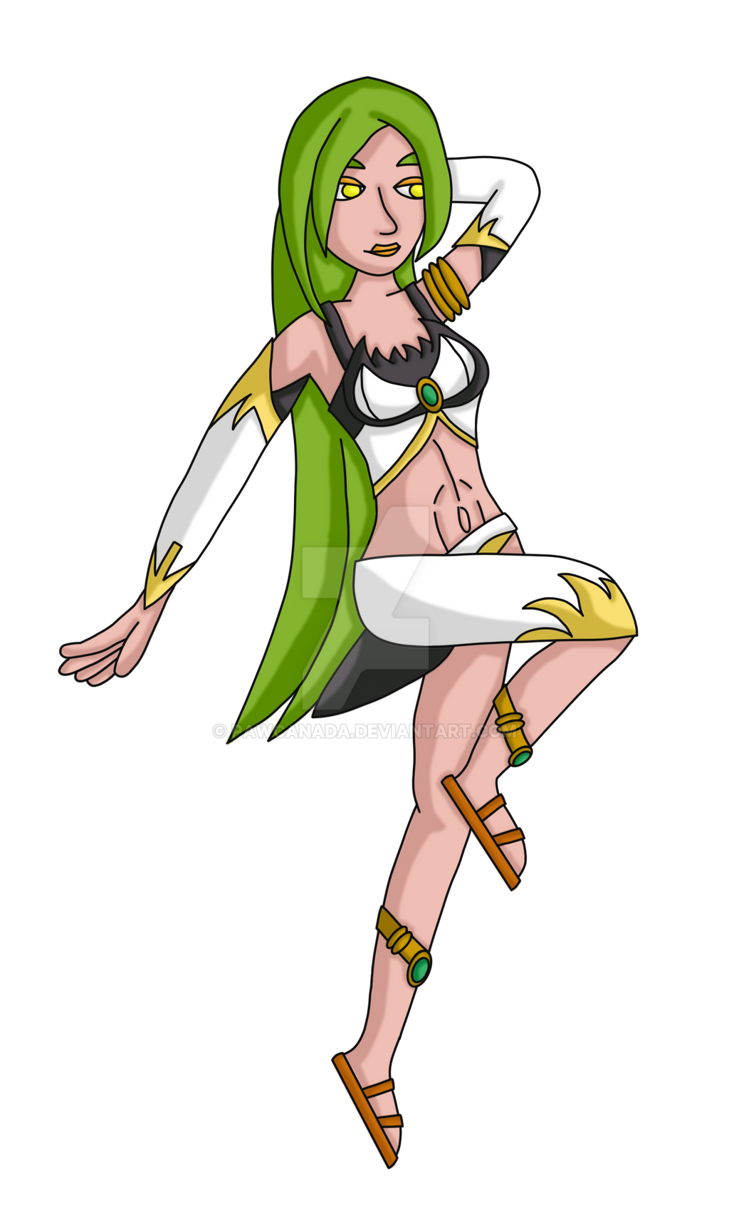
An immortal creature made by the Gods to fight a problem they once created, Monicha has lived for countless centuries as an embodiment of the Wind. However, she rebelled from against them and Monicha instead spends her long life living in her more beautiful, seductive form over the harpy, allowing her to hide from the Gods and instead spend her time seeking satisfactory experiences across her long lifespan.
As with the other Fiends, Monicha is a little sadistic but due to her fondness for beautiful maidens and the way they fill her amusements and appetites, Monicha has learned to suppress this urge, allowing herself to indulge her in other ways for centuries on end. However when adventures come seeking her head, the long repressed desire to kill and maim unleashes itself and once it's over she finds the surrounding areas destroyed and empty of the things she loved, forcing her to move on again in the hopes of finding to satisfy her appetite.
Pose and Anatomy - All in all I'm generally happy with how this version turned out. As before I really liked how this pose came out, and I feel it fits the more playful, seductive nature I feel this character has. I tried enlarging the bust when compared to the previous, traditional version as I consider Monicha to a buxom woman but I do feel the way I drew the top hides that a little too much and as before, I also feel the breasts are a touch too forward facing considering her pose.
One of the main concerns I had when fixing this piece was to fix the foot on the bent leg. nocturnaliss pointed out it was impossible anatomy wise for it to be in a straight line from the knee. I'll admit I did base the new version off the other foot I had drawn, instead of drawing a brand new foot and/or re-drawing it based off the pose in the original reference picture. As a result I do feel it looks like a clone, not helped by the lack of detailing in the foot like toes. I also feel there should have been a more obvious inclusion of a heel and maybe the slight upward bend (if anyone knows the real name, please let me know) between the heel and toes. I also wanted to add a little more shape to the straight leg, as I felt the calf muscle was too flat in the previous version. While I am happy wit the shape, it wasn't until I was done that I noticed just how wonky the line was.
The stage left hand is something I was also a little unsure of. I based it off the version from the original pose sheet and, outside of shortening the length of the thumb, kept how it looked for the final version. I feel it may have been a touch too thin around the palm/base of the fingers and even wonder if the fingers are too long and/or imply there isn't really a palm there at all.
Design and Colour Palette - I'll admit I was very unsure about the colour palette for this piece. Those who watch me may have noticed a recent submission I made called "Colour Variants":
:origin()/pre15/4092/th/pre/i/2016/304/c/0/wind_fiend_monicha___pinup__colour_variants__by_pawcanada-damqw6c.png)
As mentioned in that piece, I was very unsure how best to go forward with this character's skin and hair colour. On the one hand I wanted to give her a slightly darker skin tone, inspired by the commission kagato007 did as, while I realise the darker colours were due to the piece being set at night, I felt it fit well. On the other hand I wanted to keep the lighter forest green hair colour, as nocturnaliss suggested that shade worked better, and I found the two clashed a little. I did feel the darker skin tone worked well with the darker hair colour toonartist used in the original piece and did strongly consider going with that instead but ultimately kept "Variant 1". Depending on feedback I get here and/or on the "variant" piece, I may modify her design in the future. As for the remaining colours, generally I'm happy with how they turned out, and while I did consider using beige as an alternative to the white on her clothes, I found it didn't work too well with the other colours.
Design wise I decided to stick with the variation I made to toonartist's design I made with the traditional version, namely on the top. I did change some of the gold detailing to a light yellow to make it stand out a little more in comparison and I feel it helps separate it a little from the jewelry. Speaking of, I also added on more gems to the bracelets on her legs, and due to me changing the hair to a lighter green as per nocturnaliss' suggestion, I went with a shade of green toonartist used on the hair in his piece as a slight homage. I also played up with the design on the top a little more. It wasn't my initial plan as I was playing around with the curved lines to try and find something that would centralise nicely. Eventually I found something that worked and, liking the multiple curves, drew some new lines based off what I had come up with to try and have it flow better. I will add that yes, the curves are meant to go in one direction between they meet in the middle (which the gem represents), then go the other way. The top was one of the last things I drew for this piece and the way I had drawn it vs the time I had left to finish it (end of October) meant I had to live with a slight mistake to ensure I hit my deadline. Sure, "Done is better than Perfect", but I would have preferred it if I had got that sorted. The sandals were a new addition to her clothes as she lacked footwear in either of the commissions I've made so far. I felt, for a creature that have lived for centuries and liked emerged from whatever equivalent to ancient Greece exists in my universe, sandals would be her preferred choice. I played around with a few variations of the colours I had previously used on the clothes but settled for brown which I feel stands out more. Finally I also changed the lip and eyeliner colour to a yellow/orange colour. My initial plan was to make them the same shade of yellow as her eyes, and that her lips are the same shade of yellow but I felt a slight variation in the colour worked better to help differentiate them and also make it more like makeup.
Shading - As with the previous picture, I tried adding a little more "shape" to the shading, instead of just following the places where I thought there would be shading but I'm not sure how well that turned out, especially considering a "final touch" I applied which I'll get to. There were also some issues I had on the placement of the shading, such as on the stage left arm; should I have covered the entire thing in shade or leave parts that could be exposed to the light alone? The same goes for the hair; should I have added more shading to the stage left side of it? I've been meaning to look up some tutorials on shading to both brush up my knowledge of it and also see if I can pick up any new tips, but as I often find I finish the lines with only a few days to my deadline, the shading has been something I sacrifice to make sure I meet it.
As mentioned, I added a "final touch" to the shading by using the "gaussian blur" option once I had finished. I felt it gave the shading a more smoother edge when compared to what I had originally done but may have also removed some of the detailing I attempted to add in.
Previous Version:
:origin()/pre01/1e8e/th/pre/i/2016/286/c/d/wind_fiend_monicha___pinup__traditional__by_pawcanada-daksd61.png)
Design heavily based off the version toonartist drew
:origin()/pre11/28d2/th/pre/i/2016/027/2/6/wind_fiend_monicha_by_toonartist-d9pk3w6.jpg)
Additional elements based off the version drawn by kagato007
:origin()/pre10/5fe8/th/pre/f/2016/103/b/2/i_love_the_smell_of_air_in_the_night_by_kagato007-d9ysose.jpg)
Pose based off one drawn by GALEKA-EKAGO in "430 Pin up ten Pose study03"
:origin()/pre08/3538/th/pre/i/2014/213/b/3/430_pin_up_ten_pose_study03_by_galeka_ekago-d7oqxxs.jpg)
As with the other Fiends, Monicha is a little sadistic but due to her fondness for beautiful maidens and the way they fill her amusements and appetites, Monicha has learned to suppress this urge, allowing herself to indulge her in other ways for centuries on end. However when adventures come seeking her head, the long repressed desire to kill and maim unleashes itself and once it's over she finds the surrounding areas destroyed and empty of the things she loved, forcing her to move on again in the hopes of finding to satisfy her appetite.
Pose and Anatomy - All in all I'm generally happy with how this version turned out. As before I really liked how this pose came out, and I feel it fits the more playful, seductive nature I feel this character has. I tried enlarging the bust when compared to the previous, traditional version as I consider Monicha to a buxom woman but I do feel the way I drew the top hides that a little too much and as before, I also feel the breasts are a touch too forward facing considering her pose.
One of the main concerns I had when fixing this piece was to fix the foot on the bent leg. nocturnaliss pointed out it was impossible anatomy wise for it to be in a straight line from the knee. I'll admit I did base the new version off the other foot I had drawn, instead of drawing a brand new foot and/or re-drawing it based off the pose in the original reference picture. As a result I do feel it looks like a clone, not helped by the lack of detailing in the foot like toes. I also feel there should have been a more obvious inclusion of a heel and maybe the slight upward bend (if anyone knows the real name, please let me know) between the heel and toes. I also wanted to add a little more shape to the straight leg, as I felt the calf muscle was too flat in the previous version. While I am happy wit the shape, it wasn't until I was done that I noticed just how wonky the line was.
The stage left hand is something I was also a little unsure of. I based it off the version from the original pose sheet and, outside of shortening the length of the thumb, kept how it looked for the final version. I feel it may have been a touch too thin around the palm/base of the fingers and even wonder if the fingers are too long and/or imply there isn't really a palm there at all.
Design and Colour Palette - I'll admit I was very unsure about the colour palette for this piece. Those who watch me may have noticed a recent submission I made called "Colour Variants":
As mentioned in that piece, I was very unsure how best to go forward with this character's skin and hair colour. On the one hand I wanted to give her a slightly darker skin tone, inspired by the commission kagato007 did as, while I realise the darker colours were due to the piece being set at night, I felt it fit well. On the other hand I wanted to keep the lighter forest green hair colour, as nocturnaliss suggested that shade worked better, and I found the two clashed a little. I did feel the darker skin tone worked well with the darker hair colour toonartist used in the original piece and did strongly consider going with that instead but ultimately kept "Variant 1". Depending on feedback I get here and/or on the "variant" piece, I may modify her design in the future. As for the remaining colours, generally I'm happy with how they turned out, and while I did consider using beige as an alternative to the white on her clothes, I found it didn't work too well with the other colours.
Design wise I decided to stick with the variation I made to toonartist's design I made with the traditional version, namely on the top. I did change some of the gold detailing to a light yellow to make it stand out a little more in comparison and I feel it helps separate it a little from the jewelry. Speaking of, I also added on more gems to the bracelets on her legs, and due to me changing the hair to a lighter green as per nocturnaliss' suggestion, I went with a shade of green toonartist used on the hair in his piece as a slight homage. I also played up with the design on the top a little more. It wasn't my initial plan as I was playing around with the curved lines to try and find something that would centralise nicely. Eventually I found something that worked and, liking the multiple curves, drew some new lines based off what I had come up with to try and have it flow better. I will add that yes, the curves are meant to go in one direction between they meet in the middle (which the gem represents), then go the other way. The top was one of the last things I drew for this piece and the way I had drawn it vs the time I had left to finish it (end of October) meant I had to live with a slight mistake to ensure I hit my deadline. Sure, "Done is better than Perfect", but I would have preferred it if I had got that sorted. The sandals were a new addition to her clothes as she lacked footwear in either of the commissions I've made so far. I felt, for a creature that have lived for centuries and liked emerged from whatever equivalent to ancient Greece exists in my universe, sandals would be her preferred choice. I played around with a few variations of the colours I had previously used on the clothes but settled for brown which I feel stands out more. Finally I also changed the lip and eyeliner colour to a yellow/orange colour. My initial plan was to make them the same shade of yellow as her eyes, and that her lips are the same shade of yellow but I felt a slight variation in the colour worked better to help differentiate them and also make it more like makeup.
Shading - As with the previous picture, I tried adding a little more "shape" to the shading, instead of just following the places where I thought there would be shading but I'm not sure how well that turned out, especially considering a "final touch" I applied which I'll get to. There were also some issues I had on the placement of the shading, such as on the stage left arm; should I have covered the entire thing in shade or leave parts that could be exposed to the light alone? The same goes for the hair; should I have added more shading to the stage left side of it? I've been meaning to look up some tutorials on shading to both brush up my knowledge of it and also see if I can pick up any new tips, but as I often find I finish the lines with only a few days to my deadline, the shading has been something I sacrifice to make sure I meet it.
As mentioned, I added a "final touch" to the shading by using the "gaussian blur" option once I had finished. I felt it gave the shading a more smoother edge when compared to what I had originally done but may have also removed some of the detailing I attempted to add in.
Previous Version:
Design heavily based off the version toonartist drew
Additional elements based off the version drawn by kagato007
Mature Content
Pose based off one drawn by GALEKA-EKAGO in "430 Pin up ten Pose study03"
Image size
1500x2500px 820.57 KB
© 2016 - 2024 pawcanada
Comments97
Join the community to add your comment. Already a deviant? Log In
I think you did a great job on this one, I really love the design!